React SVG Tooltips
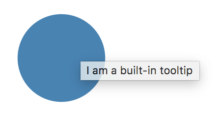
SVG has built-in support for tooltips through its <title> element. However, the rendered text looks very basic and cannot easily by styled:
Tooltips are an important design element when creating information-heavy, visual applications. They allow keeping the user interface clean, providing information only when needed. As Shneiderman (1996) put it in his famous visual information-seeking mantra:
Overview first, zoom and filter, then details-on-demand
Overview first, zoom and filter, then details-on-demand
Overview first, zoom and filter, then details-on-demand
Tooltips cover the details-on-demand aspect. However, in order to provide such details in an appealing way, built-in SVG tooltips are often not sufficient.
SVG Tooltips
There’s actually a pretty good technology out there to design appealing graphical UI elements: SVG! It is way superior to simple text boxes.
In an ideal SVG world, tooltips would:
- Be specific to an element
- Be visible on demand (mouse hovering)
- Support fully customizable SVG contents
- Appear always on top
Good News: If you’re using React, I have got you covered! Meet react-svg-tooltip, my npm package that addresses all SVG tooltip needs.
Intro to react-svg-tooltip
The library offers a Tooltip component which can be embedded in any SVG element hierarchy:
import * as React from 'react';
import { Tooltip } from 'react-svg-tooltip';

const App = () => {

    const circleRef = React.createRef<SVGCircleElement>();

    return (
        <div className='App'>
            <svg viewBox='0 0 100 100'>
                <circle ref={circleRef} cx={50} cy={50} r={10} fill='steelblue'/>
                <Tooltip for={circleRef}>
                    <rect x={2} y={2} width={10} height={5} rx={.5} ry={.5} fill='black'/>
                    <text x={5} y={5} fontSize={2} fill='white'>Yay!</text>
                </Tooltip>
            </svg>
        </div>
    );
};

export default App;
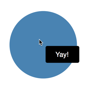
The component covers all requirements listed above:
- Its
forproperty accepts a reference to an element which serves as the mouse trigger
- All mouse listener handling is happening behind the scenes
- Arbitrary SVG can be used as tooltip contents. In fact, the library itself does not provide an actual tooltip. Instead, it gives you a 0-based coordinate system, so you can place your favorite SVG elements in whichever style suits your needs.
- Contents are attached to the root
svgelement (using a React portal behind the scenes). Thereby your tooltip will always be rendered last, i.e. always on top.
As usual, all code is on GitHub, feedback is very welcome, and PRs are highly appreciated!