A CSS Subgrid Example
Whenever I hear about a new technology or language feature, the first question I ask myself is: Which problem does it solve? So when I learned about the addition of subgrid to the CSS Grid Layout specification, I wanted to see a simple example which showed a subgrid-based solution to an actual problem. I found helpful videos and rock-solid-but-complicated layout arrangements, but nothing simple.
This post is the 3’-intro I was looking for:
A Simple Form
Suppose you are dealing with the following HTML form:
<form>
  <label for="name" class="field">
    <span class="label-text">Name</span>
    <input type="text" id="name" />
  </label>
  <label for="email" class="field">
    <span class="label-text">Email</span>
    <input type="email" id="email" />
  </label>
  <label for="message" class="field">
    <span class="label-text">A Looong Label</span>
    <input type="text" id="message" />
  </label>
</form>
The existing CSS Grid layout already makes it easy to arrange individual fields:
.field {
    display: grid;
    grid-template-columns: auto 1fr;
    grid-column-gap: 1em;
    margin-bottom: 1em;
}
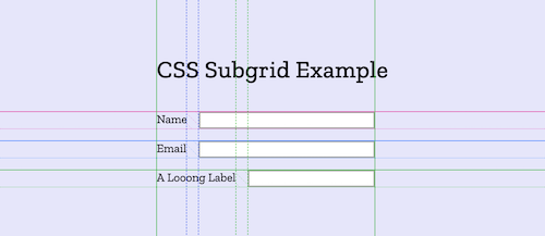
As a result, each row dynamically respects the preferred width of its label:

While this is a good start, we would like to have something better:
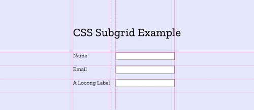
A two-column definition, so that
- the widest label determines the width of the left column
- all input fields are aligned in the right column

This is exactly what the new subgrid feature is for: It matches up its grid lines to lines in the parent grid. We move the two-column grid layout definition to the parent form, and tell the fields to align along these tracks:
form {
    display: grid;
    grid-template-columns: auto 1fr;
    grid-column-gap: 1em;
}

.field {
    display: grid;
    grid-column: span 2;
    grid-template-columns: subgrid;
    margin-bottom: 1em;
}
Caution: CSS Subgrid is only supported in Firefox (v71)